
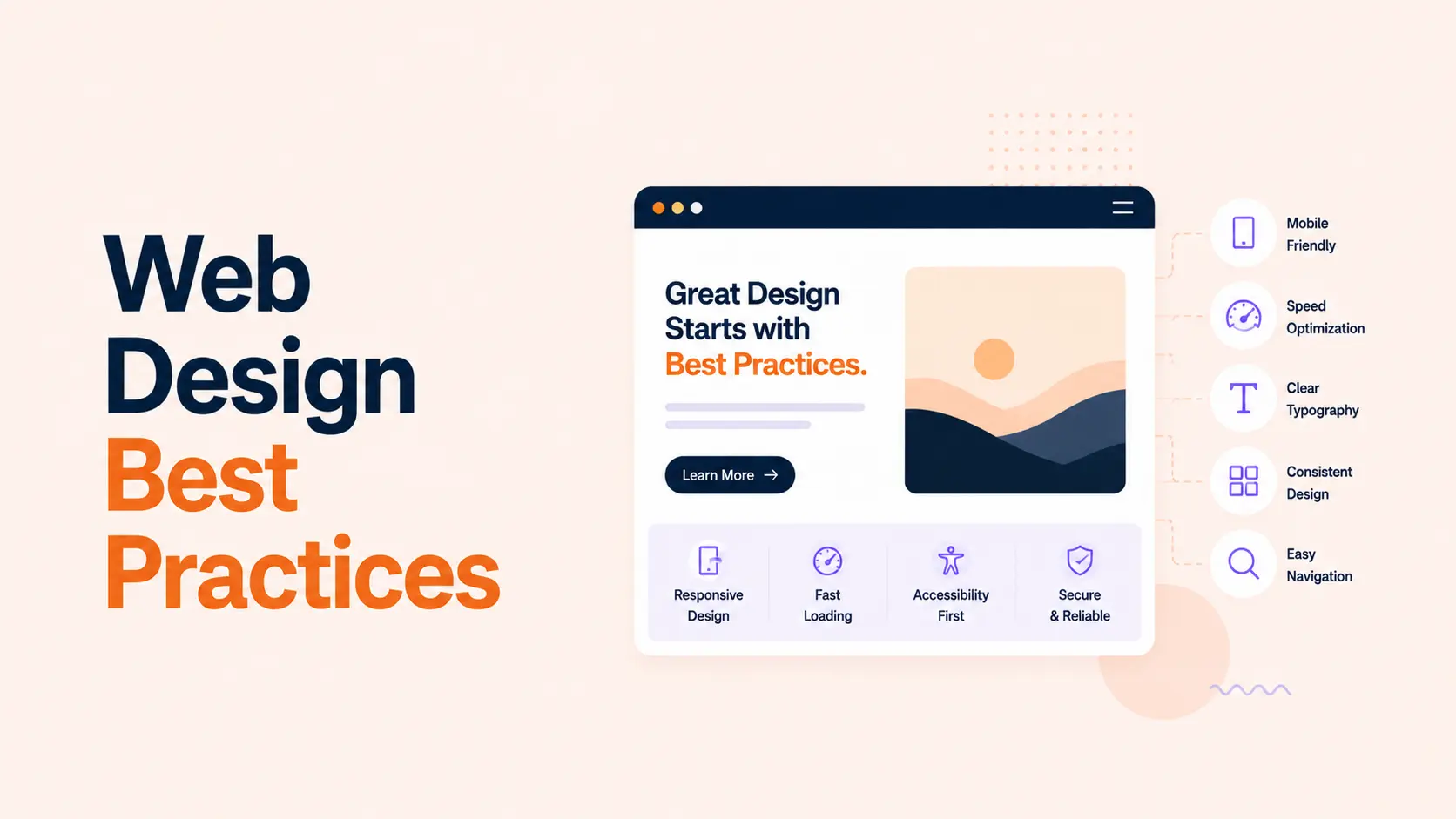


Web design best practices are not about making every website look the same. They are about removing friction between what a visitor wants to do and what the website needs them to understand, trust, or complete.
A visually impressive site can still perform poorly if the offer is unclear, navigation is confusing, pages are slow, forms are frustrating, or important actions are difficult on mobile. The strongest websites combine good visual design with usability, accessibility, performance, clear content, and measurable conversion paths.
This guide focuses on 20 principles that apply across business websites, SaaS sites, portfolios, ecommerce stores, and service pages. If you are also planning the visual direction of a new site, see our guide to web design trends in 2026. Trends can shape the look; the principles below determine whether the experience actually works.
TL;DR
Better web design makes the next useful action obvious, keeps interaction predictable, and removes unnecessary work from the user.
- Start with the page goal and user intent before choosing layouts, effects, or components.
- Use a clear visual hierarchy so visitors can understand the offer and primary action quickly.
- Keep navigation, labels, buttons, forms, and feedback predictable and easy to recognize.
- Design for mobile, keyboard use, readable contrast, and accessible interaction from the beginning.
- Treat speed as part of design. Aim for good Core Web Vitals rather than adding visual weight without a clear purpose.
- Reduce friction in forms and checkout flows by asking only for information that is needed at that stage.
- Use analytics, user behavior, and testing to improve pages instead of relying on personal preference.
What Are Web Design Best Practices?
Web design best practices are repeatable principles that make websites easier to understand and use. They cover information hierarchy, navigation, interaction, content, accessibility, performance, forms, trust, and conversion design.
Many of these ideas overlap with established usability guidance. Nielsen Norman Group’s 10 usability heuristics emphasize visibility of system status, consistency, error prevention, recognition rather than recall, user control, and minimalist design. Those principles remain useful because they describe how people interact with interfaces, not a temporary visual style.
20 Web Design Best Practices for Better UX and Conversions
1. Give Every Page One Clear Primary Goal
A page becomes harder to use when it tries to make every action equally important. Decide what the visitor should understand or do next. On a service page, that might be requesting a quote. On a product page, it may be choosing a variant and adding the item to the cart. On a blog post, it may be finding an answer and moving to a related resource.
Secondary actions can still exist, but they should not compete visually with the primary one. A clear page goal improves copy, hierarchy, CTA placement, and measurement because the team knows what success looks like.
2. Make the Value Proposition Clear Before the Design Gets Clever
The top of the page should answer the visitor’s first questions: What is this? Who is it for? Why should I care? What can I do next? A beautiful hero section cannot compensate for vague positioning.
Use a specific headline, short supporting copy, and a relevant primary action. Avoid slogans that require the visitor to decode what the company sells. Brand personality can come through typography, imagery, and tone after the core message is understandable.
3. Build a Strong Visual Hierarchy
Visual hierarchy tells people what to notice first, second, and third. Use heading size, weight, spacing, contrast, alignment, and grouping to separate primary information from supporting details.
Do not solve hierarchy by making everything larger or bolder. If headings, buttons, cards, statistics, and badges all demand equal attention, the page has no hierarchy. The strongest layouts use contrast selectively and give important elements enough surrounding space to stand out.
4. Keep Navigation Simple and Predictable
Navigation should help users form a quick mental model of the site. Use familiar labels such as Services, Pricing, About, Blog, Contact, or Shop when those labels accurately describe the destination. Internal company language and clever menu names often create unnecessary interpretation work.
Keep high-value destinations easy to reach, make the current location clear, and ensure mobile navigation is just as understandable as desktop. If the site has many pages, group them by user intent rather than forcing every URL into the main menu.
5. Write and Design for Scanning
Most visitors will not process a page line by line before deciding whether it is relevant. Help them scan by using descriptive headings, short paragraphs, meaningful lists, comparison tables where useful, and visible labels for important information.
A heading should communicate the point of the section, not merely introduce a theme. Replace headings such as “Our Approach” with something more informative when possible, such as “How We Reduce WordPress Load Time.” Clear structure also supports search engines and AI systems that need to understand page relationships.
6. Use a Consistent Design System
Buttons, colors, spacing, cards, form fields, typography, icon styles, and interaction states should behave consistently across the site. Consistency reduces learning effort because users do not have to interpret each page as a new interface.
For growing websites, define reusable variables and components instead of styling pages independently. This makes future updates faster and helps prevent visual drift. It also makes responsive behavior and accessibility easier to maintain across templates.
7. Design Mobile Experiences, Not Just Smaller Desktop Pages
Responsive design is more than stacking columns. Reconsider hierarchy, tap targets, navigation, text length, image crops, tables, sticky elements, forms, and CTA placement for narrow screens.
Test common tasks on real mobile widths. A layout can technically fit while still being frustrating because buttons are crowded, menus require too many taps, headings wrap awkwardly, or sticky banners cover too much of the viewport. Mobile decisions should be part of the design process, not a cleanup pass at the end.
8. Make Website Speed a Design Requirement
Performance affects whether the designed experience can be delivered smoothly. Google’s current Core Web Vitals guidance defines “good” thresholds as Largest Contentful Paint (LCP) of 2.5 seconds or less, Interaction to Next Paint (INP) of 200 milliseconds or less, and Cumulative Layout Shift (CLS) of 0.1 or less, measured at the 75th percentile.
Large hero videos, unoptimized images, excessive font files, animation libraries, sliders, third-party scripts, and heavy JavaScript can all create performance costs. Ask what each asset contributes. If the experience remains clear without it, removing the asset can improve both speed and focus.
9. Treat Accessibility as Part of the Design System
Accessibility should influence color, typography, controls, focus states, forms, media, and interaction patterns from the start. Under WCAG 2.2, Level AA text contrast is at least 4.5:1 for normal text and 3:1 for large text. Keyboard-operable controls also need a visible focus indicator.
Use semantic headings, descriptive labels, meaningful link text, alt text where images convey information, keyboard-accessible menus, and reduced-motion support where relevant. Accessibility usually makes the interface easier for more people, including users on small screens, in poor lighting, or using alternative input methods.
10. Make Interactive Targets Easy to Tap and Click
Small controls create avoidable errors, especially on touchscreens. WCAG 2.2 Level AA includes a 24 by 24 CSS pixel minimum target-size criterion with defined exceptions. WCAG’s enhanced AAA target is 44 by 44 CSS pixels.
In practical interface design, give buttons, menu items, pagination, close icons, checkboxes, and other controls enough size and spacing that users can activate the intended target without precision. Do not rely on a tiny icon when the surrounding label or container can be clickable too.
11. Make Calls to Action Specific and Visually Distinct
A CTA should describe the next action clearly. “Start a Project,” “Get a Quote,” “View Pricing,” or “Download the Guide” usually provides more context than a generic “Learn More.”
Use one primary CTA style consistently across the site. Place the action where the user has enough context to take it: near the value proposition, after proof, at the end of a service explanation, or beside pricing. Repeating the same relevant CTA on a long page is useful; introducing a different primary CTA in every section is usually distracting.
12. Reduce Cognitive Load and Unnecessary Choices
Every extra choice, label, field, visual effect, and competing message asks the user to spend attention. Simplification should remove decisions that do not help the user complete the current task.
This does not mean hiding useful information. It means sequencing information well. Show the most important options first, disclose advanced settings when needed, group related controls, use sensible defaults, and avoid asking users to remember information that the interface could display for them. This aligns with Nielsen Norman Group’s principle of recognition rather than recall.
13. Keep Forms as Short as the Task Allows
Forms often sit directly between interest and conversion, so every unnecessary field deserves scrutiny. Ask only for information needed to complete the current step. Optional information can often be collected later.
Baymard’s checkout research found that 17% of users had abandoned an order because checkout felt too long or complicated. Their research also emphasizes that the number of fields users must manage matters more than simply counting checkout steps. The same principle is useful for lead forms: reduce avoidable effort, label fields clearly, and explain why unusual information is required.
14. Show Immediate Feedback After User Actions
When someone clicks a button, submits a form, adds an item, changes a filter, uploads a file, or starts a process, the interface should make the result visible. Feedback can be a loading state, success message, progress indicator, changed button state, inline confirmation, or updated total.
This follows the usability principle of visibility of system status. Without feedback, users may click repeatedly, wonder whether the page is broken, or abandon the task. For longer operations, tell users what is happening rather than showing an unexplained spinner.
15. Prevent Errors and Make Recovery Easy
Good interfaces prevent common errors before they happen. Use sensible input types, constraints, examples, confirmation for destructive actions, and clear distinctions between primary and dangerous buttons.
When an error does occur, explain what happened and how to fix it. WCAG 2.2 requires automatically detected input errors to be identified and described in text. Avoid messages such as “Invalid input” when you can say “Enter an email address in the format name@example.com.” Preserve valid form entries so one mistake does not force the user to start again.
16. Put Trust Signals Where the Decision Happens
Trust content is most useful near the point of uncertainty. A testimonial beside a service explanation, return policy near purchase information, security/payment context near checkout, or recognizable client proof near a contact CTA can answer doubts at the right moment.
Avoid building a large “trust section” while leaving critical claims unsupported elsewhere. Use specific evidence: named testimonials when permission exists, case-study results with context, clear policies, real contact information, author credentials, product guarantees, or transparent pricing details. Trust is created by consistency across the whole journey.
17. Use Images and Media to Explain, Not Decorate
Images can demonstrate a product, show the people behind a company, explain a process, support a case study, or create brand identity. They are less useful when they are interchangeable stock photos that do not add meaning.
Choose media based on the job it performs. Screenshots are often stronger for software explanations. Product photography matters in ecommerce. Diagrams can simplify complex services. Compress and size media appropriately, reserve layout space to reduce shifting, and avoid autoplay video when it distracts from the main task.
18. Improve Conversions Without Using Dark Patterns
Conversion design should make a valuable next step easier, not manipulate the user into one. Avoid hidden fees, disguised ads, confusing unsubscribe controls, preselected extras, false scarcity, or buttons designed to make the unwanted choice difficult to find.
Baymard reports a global average ecommerce cart abandonment rate of about 70%, with avoidable issues such as high unexpected costs, forced account creation, complex checkout, errors, and lack of trust contributing to abandonment among users who were not simply browsing. Better conversion design reduces those sources of friction instead of trying to pressure the visitor.
19. Keep SEO and Discoverability in the Design Process
A page that looks good but hides important content behind scripts, weak headings, vague labels, or poor internal linking can be difficult for both people and search systems to understand. Design and SEO should share the same information architecture.
Use one clear page topic, logical headings, descriptive internal links, crawlable content, useful image alt text, and strong page performance. If the site runs on WordPress, our WordPress SEO checklist covers the technical and on-page foundations in more detail. Platform choice can also affect how easily teams manage design and content; see WordPress vs Shopify vs Webflow for those trade-offs.
20. Test the Website With Real Behavior, Not Preference
A design review can catch obvious problems, but it cannot tell you everything about how visitors behave. After launch, use analytics, Search Console, form completion data, session recordings where privacy rules allow, support questions, sales feedback, and usability testing to find friction.
Measure the outcome that matches the page goal. A landing page might be judged by qualified leads, not clicks. An ecommerce page needs product discovery, add-to-cart, checkout, and purchase data. A content page may be measured through search visibility, engagement, and assisted conversions. Change one meaningful variable at a time when possible so you can understand what improved.
How to Prioritize Web Design Improvements
You do not need to redesign an entire website to apply these principles. Start with the biggest source of friction and work outward.
- If visitors do not understand the offer: fix the value proposition, page hierarchy, headings, and primary CTA first.
- If traffic is healthy but conversions are weak: review CTA clarity, trust, form friction, pricing context, and the steps between intent and completion.
- If mobile performance is poor: simplify responsive layouts, reduce media weight, check tap targets, and test navigation and forms on real devices.
- If pages are slow: review LCP media, fonts, scripts, third-party widgets, caching, and server response before adding more visual effects.
- If users get stuck: improve navigation, system feedback, validation, error messages, and task sequencing.
- If the site is difficult to maintain: consolidate styles into reusable components, variables, and templates.
For a new build or major rebuild, these decisions are easier to make before development begins. Tenfic’s web design and development service approaches structure, performance, responsive behavior, and conversion paths as parts of the same system rather than separate finishing tasks.
Web Design Best Practices Checklist
- Each important page has one defined primary goal.
- The headline explains the offer or page purpose clearly.
- The primary CTA is specific and visually distinct.
- Navigation uses familiar, descriptive labels.
- Headings create a logical, scannable hierarchy.
- Body text is readable at common desktop and mobile widths.
- Components and interaction patterns are consistent.
- Mobile layouts are intentionally designed and tested.
- Core Web Vitals and real-world page speed are monitored.
- Text contrast, focus states, keyboard use, labels, and target sizes are checked for accessibility.
- Forms ask only for information needed at that stage.
- Success, loading, and error states provide clear feedback.
- Trust signals appear near important decisions.
- Images and video serve a clear purpose and are optimized.
- SEO, internal linking, and crawlable content are preserved.
- Analytics and user behavior are used to guide future changes.
Good Web Design Reduces Friction
The best web design practices are not a collection of visual rules. They are a way to make the website easier to understand, easier to operate, and easier to trust.
Start with user intent and the page goal. Build a clear hierarchy. Keep interaction predictable. Make mobile, accessibility, and performance part of the design system. Then use real behavior to improve the experience after launch.
A website does not need every modern effect to convert well. It needs to help the right visitor reach the right information and complete the next useful action with as little unnecessary friction as possible.
Frequently Asked Questions
What are the most important web design best practices?
The most important practices are clear page goals, strong visual hierarchy, simple navigation, readable content, mobile responsiveness, fast performance, accessibility, clear CTAs, low-friction forms, useful feedback, trust signals, and continuous testing.
How does good web design improve conversions?
Good web design reduces the effort and uncertainty between a visitor’s intent and the desired action. Clear messaging, visible CTAs, useful proof, simple forms, predictable interaction, and fast pages make it easier for qualified visitors to complete the next step.
What is the difference between UX design and web design?
Web design covers the visual and interactive presentation of a website. UX design focuses more broadly on how people understand, navigate, and complete tasks within the experience. In practice, strong modern web design includes UX principles rather than treating appearance and usability as separate concerns.
How important is website speed for UX?
Website speed is part of the user experience because delays affect when content appears and how quickly interactions respond. Google’s Core Web Vitals measure loading, responsiveness, and visual stability using LCP, INP, and CLS.
What accessibility standards should web designers follow?
WCAG 2.2 is the current W3C Recommendation for web accessibility. For many business sites, WCAG Level AA is the common target, covering areas such as contrast, keyboard access, focus visibility, target sizing, form errors, and content structure.
How often should a business redesign its website?
There is no useful fixed redesign schedule. Redesign when the current site no longer supports user needs, brand positioning, business goals, content structure, technology, performance, or maintainability. Many sites can improve through targeted changes instead of a full rebuild.
Should every website follow the same web design best practices?
The principles are broadly useful, but implementation should match the audience and task. An ecommerce checkout, SaaS dashboard, law firm site, portfolio, and news publication need different content density and interaction patterns. The goal is consistent usability, not identical layouts.